Brainport Experience Box concept
-
Objective
"How can we innovate the experience for the visitor in the Brainport Experience Box during a football match?"
-
Role
UX Designer (Research, Visual Design, Interaction Design, Usability Testing)
-
Tools
Figma, Miro, Illustrator
-
Team
Group of 6 students
Summary
The soccer team from Eindhoven has a special box in cooperation with Brainport Eindhoven (Brainport Experience Box) in the stadium where they can test on innovative technology, to think about what the future of soccer stadium experience looks like. Per season, thirteen guests per game are allowed to test innovative technologies before, during and after the match to test innovative technologies. The purpose of the assignment is to come up with creative concept for the Brainport Experience Box.
Brainstorming
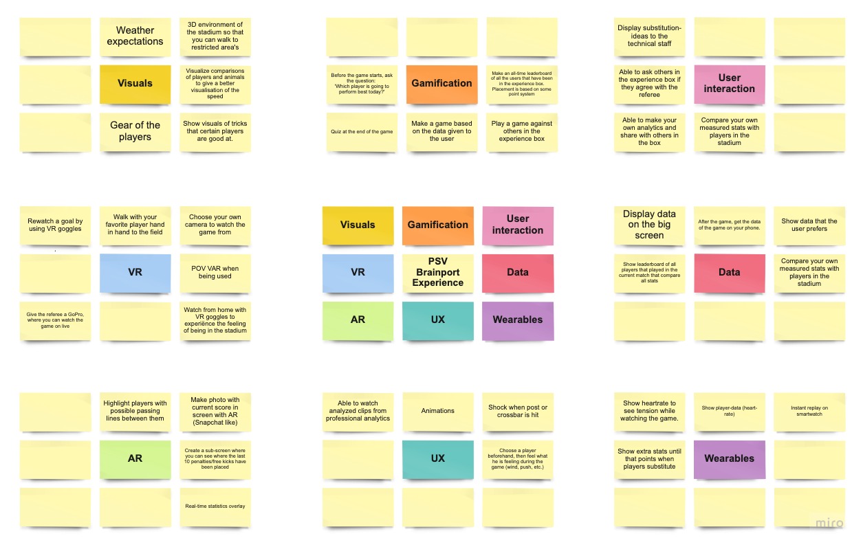
We examined which trends and techniques are relevant to PSV as a concept. This was done through brainstorming. In this brainstorming session the Lotus diagram was used. The lotus diagram is a tool for brainstorming in which a visual representation of an idea is used. The lotus diagram begins with a central idea or theme, and then is expanded iteratively through solution areas or related themes. In this case, that's the PSV Brainport Experience box. The middle square of the lotus diagram of each blossom contains the main concept or idea. The other squares of the blossom are related to it. related. The topics considered include: Visuals, gamification, UI, VR, AR, UX, data and wearables. This is further elaborated in the lotus diagram.
In order to gain more insights on our users, what they think of our concepts and what kind of ideas they have, a survey was conducted. In this they were asked which concept they liked the most which resulted in a concept where scoreline predictions can be made and compared with other players. This proves the potential of this concept and thus it was developed further. None of the ideas were deemed interesting enough for the project.
Ideation & concepting
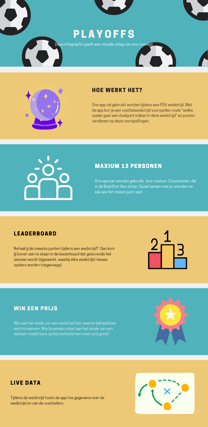
Based on this brainstorming session and in consultation with the stakeholder, one concept came forward: A predictions game, the idea is that the visitors fill in their predictions for the match. This seemed to us and the stakeholder to be the concept with the most potential. For example, we came up with an app in which you as a user can predict certain events such as "which player is going to score a goal in this match" and can compete for a prize with other individuals in the Experience Box.
Competitive Research
It is equally important to research other competitors, as their products will help me gather insights about their strengths and weaknesses. These insights also help me identify any gaps in features that our concept might address. What struck me was that all competitors have a similar way of displaying data to the user, with tables, graphs and tabs. Because there is so much data being shown to the user at once, it can be overwhelming. The key is to make it uncluttered, so that the user is not overwhelmed by data. And making sure the user can quickly and easily predict an event without overwhelming them with data. I have incorporated all the findings in a table below (written in dutch):
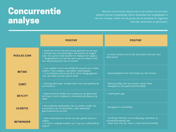
A unique selling point of our concept is that the user can decide what data to see. In addition, only related data of the match is shown and no other sports as with all competitors. The main competitors I examined are the gambling companies. This is because our concept is very similar, predicting a match. I mainly looked at how those companies show the data in their UI.
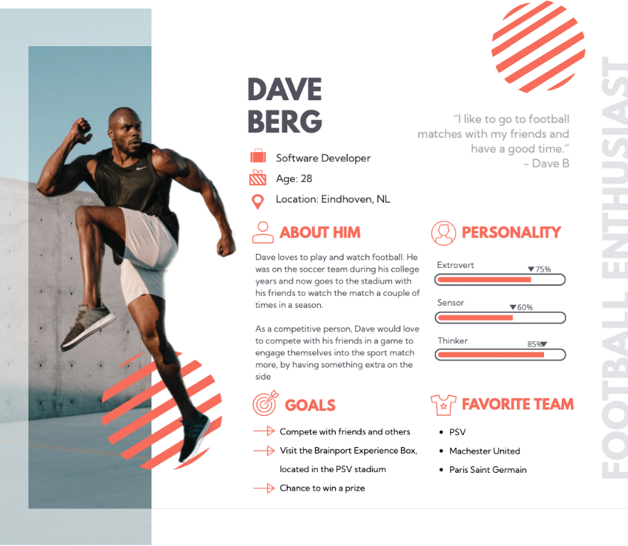
Persona
With the data gathered from previous research, I started to generate provisional persona using the statistical knowledge I gained to represent a certain type of user that are potential audience of the Brainport Experience Box.
UI Design
Backgrounds
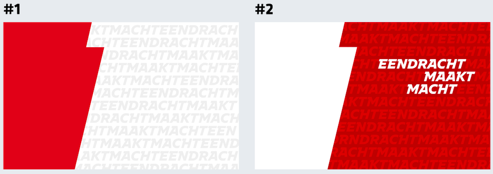
The background that is used in our app is inspired by the brand guide of PSV. I chose this so that the app feels recognizable by the users. The group liked this idea and we decided to keep it.
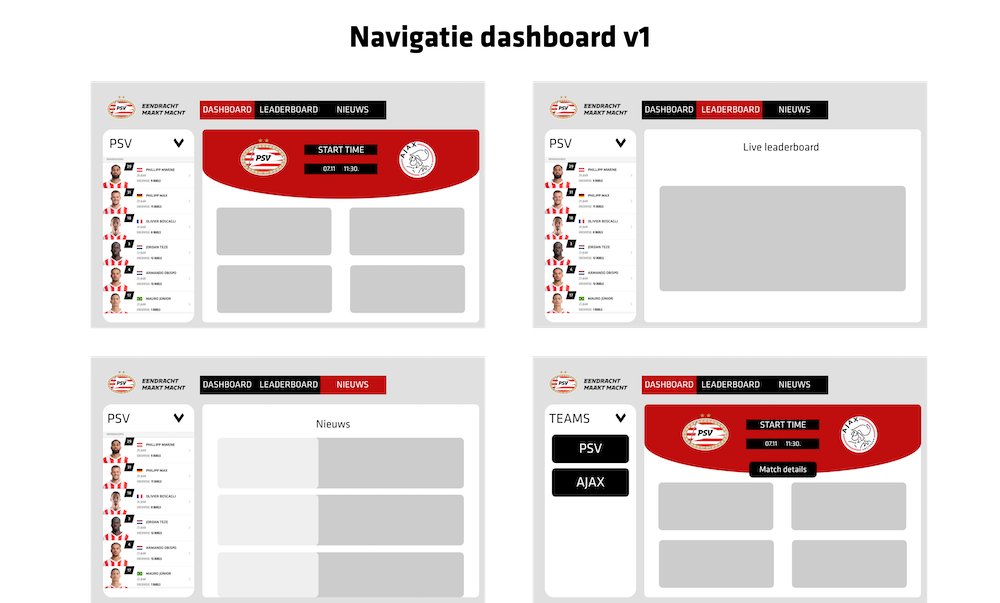
This is my first iteration of the dashboard. With the thought of keeping it as simple as possible for the user, I chose to show three main tabs in the dashboard. This mock-up is based on the mood board and inspiration that I got from Dribble.
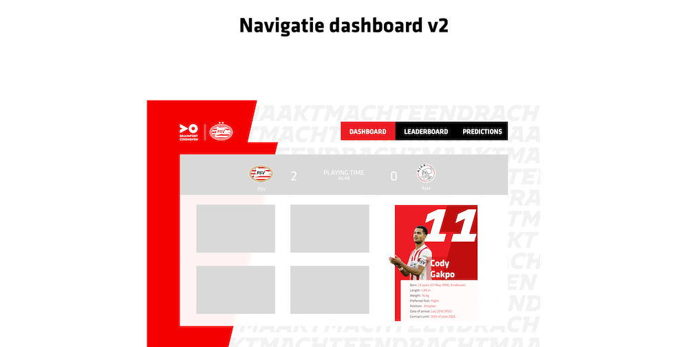
This is my second iteration of the dashboard. Which I made after feedback from the teachers and stakeholders.
User testing
We went to the PSV match in the stadium to test our concept. Here we had eleven participants in the Experience Box who were testing our concept. In this case, we wanted to know how the experience was and which parts of the tablets they used during the match. It turned out that our application did have an impact on the participants, as they talked about their predictions during the game, hoping they would come true.
On the other hand, the tablets all went off during the game, as the participants wanted to watch the game. This is an interesting development that needs further testing, but it seems pretty clear to me that there is interest in our concept. Since there is no more time to further implement and test our findings, they will be written down in the advisory report so that PSV is aware of the findings and can possibly implement and test them themselves in the future.