Efteling Plein-app
-
Objective
"How can we improve the structure and navigation of the app?"
-
Role
User interviews, data analysis, prototyping, usability testing
-
Tools
Figma, Miro, Lyssana
-
Team
Graduation project
Summary
For my graduation project at the Efteling, I focused on improving the navigation and information structure of Plein, the internal communication app used by all Efteling employees. The app was introduced three years ago to keep staff informed about organizational updates and provide access to relevant work-related information. It also serves as a communication platform between colleagues, making it a key link between the Efteling and its employees.
However, conversations with both stakeholders and users revealed several usability issues. Employees often struggle to find the information they need due to unclear navigation and scattered content. These challenges formed the starting point for my research. By mapping user needs, analyzing the app’s current structure, and testing improved concepts, I created a prototype and provided clear recommendations aimed at enhancing the app’s usability—especially for park employees who rely heavily on mobile access in their daily work.
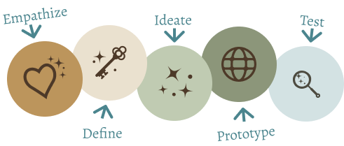
Design thinking process
Throughout this project, I followed the principles of Design Thinking because it offers a structured yet flexible approach that keeps the end user central to every decision. This method allowed me to deeply understand the needs and context of park employees, explore ideas through creative ideation, and test solutions early and often. By working iteratively and continuously involving user and stakeholder input, I was able to develop a solution that aligns with the daily routines and expectations of employees in the park, ensuring it is both relevant and practical in their fast-paced working environment.
Empathize
In the empathize phase, I immersed myself in the context and working environment of the target group. I interviewed several employees from different departments and shadowed them during their shifts. These conversations and observations provided valuable insights into their behavior, needs, and frustrations. It became clear that they needed an app that works quickly, is easy to use, and gives them direct access to relevant information. Because they don’t have fixed workstations and are often dependent on their phones, usability is essential.
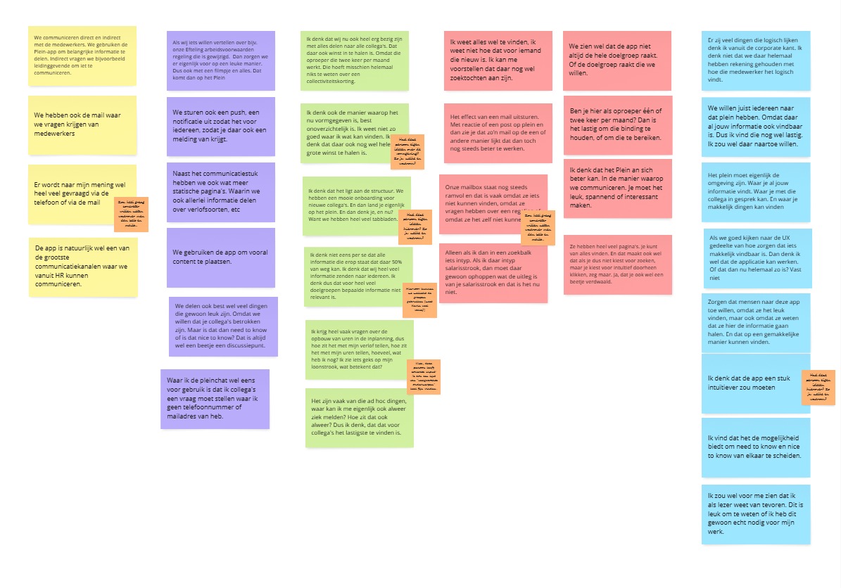
This image is one of several visual overviews created to summarize insights from user interviews. During these interviews, they discussed how they use the app to communicate, the challenges they face, and their wishes for improvement. The quotes and comments, color-coded by theme, reveal key challenges in internal communication, such as difficulties with the app’s structure. These overviews helped identify patterns and pain points, forming the basis for improving the app’s navigation and information architecture.
Define phase
To better understand how the Plein app could be improved, I conducted an expert review based on common usability principles. This analysis confirmed several issues already mentioned by users, such as unclear navigation and confusing content layout. The homepage, for example, presented different types of information all mixed together, making it difficult to quickly find what you’re looking for. Additional problems like poor contrast and duplicated navigation paths also became clear during this review.
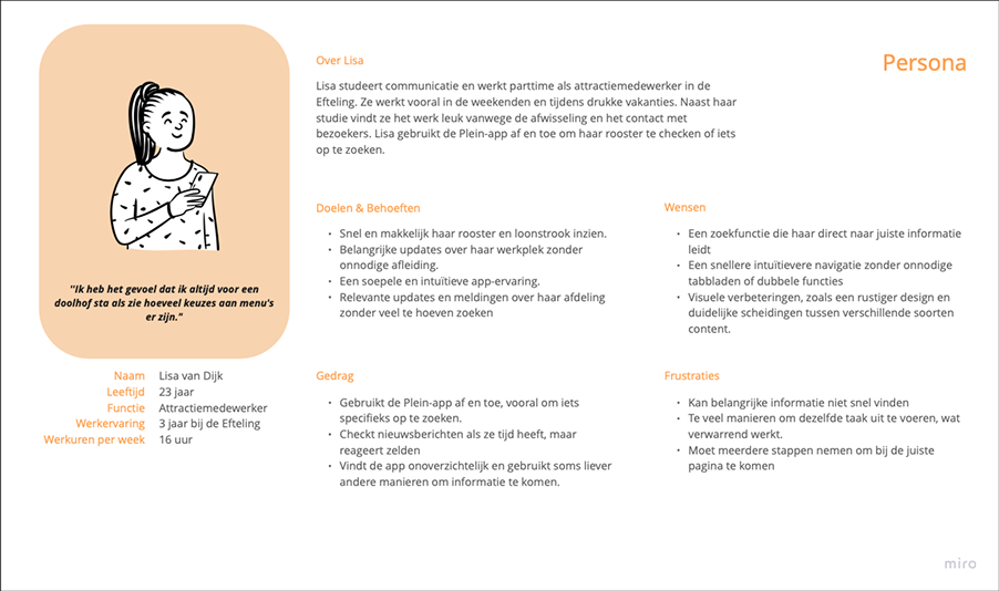
These findings helped shape the define phase, where I created personas and identified key pain points. It became clear that the structure of the app didn’t match how employees actually search for information in their daily work. As a result, many rely on other tools instead. This led to the main design challenge: "how can the navigation and structure of the Plein app be improved to make it easier and more efficient for employees to find what they need?"
Ideation phase
During the ideation phase, research insights were used to explore possible directions for improving the user experience of the Plein app. A brainstorm session helped generate ideas and opened up new perspectives. These ideas were not final solutions, but served as inspiration and input for shaping the first concept. Based on recurring themes in the research, a clearer structure was developed to make important information more accessible and easier to navigate. The goal was to reduce confusion and help users find what they need more quickly. This phase formed an important link between research and design, turning earlier findings into concrete ideas that would be further explored and tested in the next steps.
Prototype phase
In the prototype phase, I translated the chosen direction into wireframes and developed an interactive prototype in Figma. The new concept featured a simplified main navigation, a personalized home screen, and improved content categorization. The design aimed to support fast, task-oriented use in the dynamic environment of park employees.
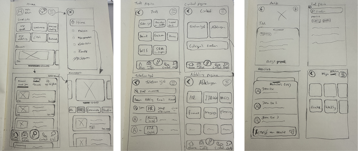
Wireframes V1
I developed wireframes to explore improvements to the Plein app, based on insights from user interviews. These wireframes focused on key screens like the homepage, news section, search function, and contact page. Park employees tested different versions and provided feedback on what worked best. They preferred clear, uncluttered designs that allowed them to quickly access relevant information with minimal effort. Direct search options, simple navigation, and personalized or filtered news were especially valued. This feedback played a key role in shaping the next steps of the design process.
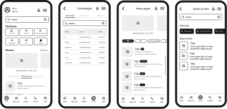
Wireframes V2
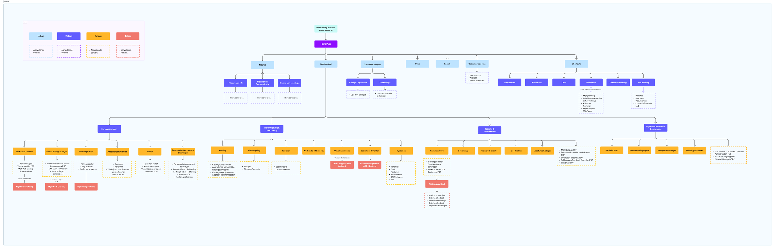
The second version of the wireframes was developed based on earlier feedback and usability insights. In this phase, I also deepened my understanding of information architecture, exploring how work-related information can be structured and displayed in a clear and intuitive way. This informed key decisions around hierarchy, grouping, and navigation patterns.
The design aligns more closely with the organization’s visual identity, using familiar colors and typography to create a sense of recognition and trust. To improve the mobile experience, softer tones were introduced to make the interface feel more accessible. The layout was refined with a clearer menu and a more compact homepage, offering space for shortcuts, updates, and personalized suggestions. User feedback highlighted improvements in clarity and structure, though there were still areas for refinement, such as color contrast and typography. These insights are being used to guide the next version of the prototype.
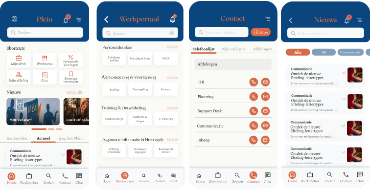
High-fidelity prototype
I developed a high-fidelity prototype that brought together all insights and feedback from earlier research into one refined visual design. This version focused on creating a realistic representation of the future Plein app, with a layout and visual style that reflect the Efteling’s internal branding.
The prototype follows common UX principles and is inspired by guidelines such as Material Design. The bottom navigation was simplified for easier access, and the overall layout was built with clear typographic hierarchy and spacing to enhance readability and create a calm user experience. Visual contrast was improved based on earlier feedback, and softer accent colors were introduced to make the interface more inviting. Content sections such as the work portal were also refined, offering clearer explanations, helping users quickly understand what each section provides.
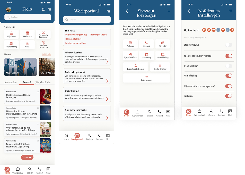
Testing phase
In this phase, I tested whether the new version of the Plein app would actually work better for park employees. I first reviewed the design using common usability principles to check if the structure and layout made sense. After that, I let five employees try out the clickable prototype and asked them to complete a few tasks, just like they would during a normal workday. Their feedback was encouraging. They said the app felt clearer, easier to use, and more logical than the current version. Most participants were able to find what they needed quickly, and they said they would prefer using this version at work.
Some also mentioned small things that could be improved, such as the visibility of the menu bar at the bottom of the screen. In addition to the user tests, I also shared the design with two UX experts at the Efteling. They confirmed that the new layout and content made sense, and they gave me helpful tips to fine-tune the design—like making text more readable and improving clickable elements. All of this feedback helped me make the prototype even better. This test phase showed that the new design is a strong improvement and that it fits well with what employees actually need.
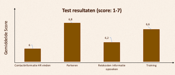
To evaluate ease of use, I asked users to rate each task using the Single Ease Question (SEQ). The consistently high scores suggest that users found the prototype easy to navigate.
Conclusion
This project demonstrates how improving the navigation and content structure of the Plein app directly enhances its usability. By putting the needs of park employees at the center of the design process, I identified key issues that made it difficult to find and use information efficiently. Through research, iteration, and user testing, I developed a solution that makes the app more intuitive, consistent, and accessible. The redesigned prototype shows that a clear structure and simplified navigation can significantly improve the user experience especially for employees who rely on the app during their workday. This outcome provides both a practical design direction and a strong foundation for future development.