Zara website Redesign
-
Objective
Create a new shopping experience
-
Role
UX Designer (Research, Visual Design, Interaction Design)
-
Tools
Sketch, Photoshop
-
Team
Personal project
Summary
This project is driven by my personal passion for enhancing user experiences, and it is not intended to include formal usability testing. As a personal initiative, I aim to apply my expertise and insights to improve the Zara website's design. While usability testing is not part of this project, my primary goal is to leverage my skills as a UX designer to create a more user-friendly and visually appealing online shopping platform inspired by industry best practices and my own experiences as a shopper.
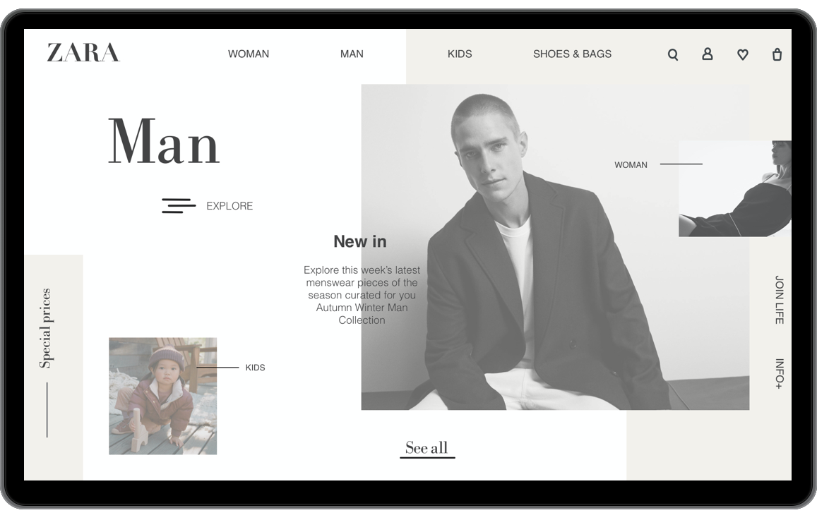
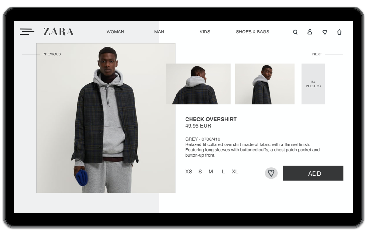
Happy flow
A happy flow is an ideal scenario for using a website without exceptional circumstances, where nothing goes wrong, nothing unusual happens, and everything progresses quickly and smoothly until the user achieves the desired result.
In this prototype, I have created a minimal way to purchase an item, also known as a happy flow. This applies even when the user wants to save the item for later. The user can store it on their favorite page, which, for me, represents a happy flow. The sequence of the happy flow proceeds in the following order: homepage - view all - first item (for example) - add button - continue button - log in or purchase as a guest.
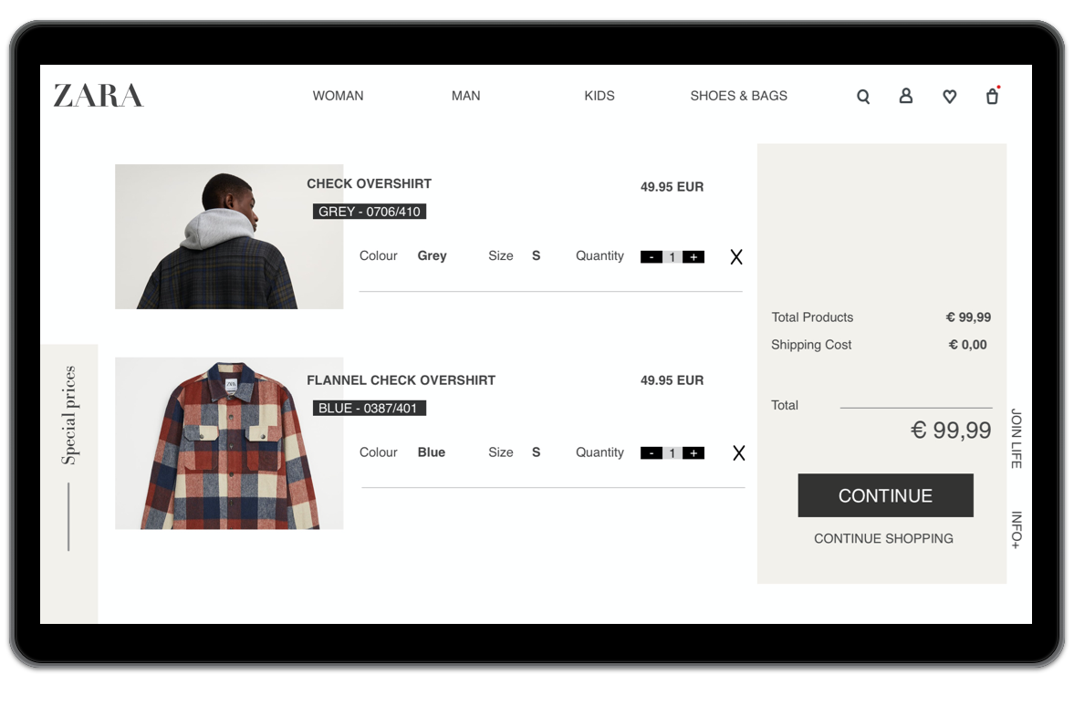
View on your shopping
At the time of writing, the Zara website does not provide a wishlist/favorites feature for users. Therefore, I have added one to my prototype. After adding items to the wishlist, users would like to see the total amount in the list.
This is available on the checkout page. The idea is to always display the final amount on the right-hand side, so users can scroll through their items without losing sight of the total. I have redesigned the checkout section with much more focus on the items, providing ample space for size, color, and price. This makes choices much easier. It gives the user a clear indication of the choices they've made. If they don't want to add the items, they can continue exploring by selecting the "continue shopping" option. The red dot on the shopping cart icon informs the user that some of the selected items have been added to the shopping cart.
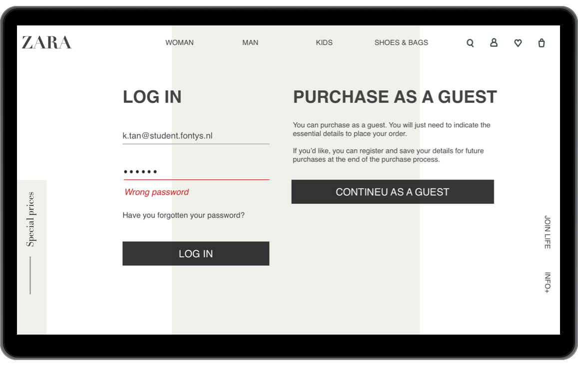
Unhappy flow
Let's take a moment to think about the user encountering an error message. They are likely to be frustrated and unable to proceed with their task. Studies indicate that errors cause stress, which is not ideal. Furthermore, if the error message is generic and doesn't fully describe the issue, it becomes a problem for the secondary audience of customer support/success.
An example of an unhappy path in this scenario could be that the user doesn't have an account yet or is trying to recover a forgotten username or password. Another example of an unhappy path is when the user has an account but has entered their information incorrectly, resulting in a lack of access to the system. Here's how this might appear on a website:
Next steps
Continue to be inspired by successful e-commerce websites like Asos. Analyze what they do well in terms of user experience, navigation, and design. Identify best practices and principles that you can apply to the Zara website.